
JUBISCO BAKERY
mobile-friendly website
Designed a responsive website for a local bakery to streamline their ordering process while keeping the friendly, personal touch that their customers love.
role
duration
UX Designer, Branding
4 Weeks
tools
Figma, Lyssna, Maze

project overview
Jubisco is a local bakery with a growing customer base in Batangas City, Philippines. The business heavily on Facebook Messenger for orders. The goal of this project was to design a responsive mobile website to streamline their ordering process, balance efficiency with personal touch, and improve overall user experience.
the challenge
Jubisco's current Facebook-based ordering system is time-consuming, leading to delayed responses and order inaccuracies. Customers, particularly regulars, value the personal touch but need a more efficient and reliable system for browsing, ordering, and tracking deliveries.
discovery
A closer look on how I uncover insights
user interviews
I started my primary research by dividing it into two parts – an interview with the stakeholders and another interview with their clients. My goal was to comprehensively understand both parties’ pain points, needs, preferences and where these would intersect through a responsive website.
👩🏽🍳👩🏻🍳 part one : understanding the story behind jubisco
It all began during the pandemic when co-founders Hanna and Beryll noticed a lack of access to fresh, quality bread in their neighborhood. What started as small weekend batches quickly gained traction as word spread in their neighborhood’s Facebook page. Soon, the demand outgrew their kitchen and Jubisco Bakery was born.
Hearing their story and learning the heart of their business over our 2 hour zoom call helped me get a feel for their values, goals and the community they’ve built around their products.
📝 what I learned from the owners?
what’s working..
Flexible payment options:
New clients pay upfront while loyal customers often use cash on delivery.
Custom orders:
Jubisco’s menu includes personal and event-sized portions, allowing them to cater to different occasions and customer preferences.
Strong word-of-mouth:
Their customer base continues to grow organically through referrals and community support which is a proof that people love their breads.
🚧
what needs to be improved..
Manual order process:
All orders go through Facebook Messenger. Automated replies help a little but real questions and follow-ups require manual handling which creates delays in order.
Messaging bottlenecks:
The back-and-forth nature of messaging makes it hard to finalize orders efficiently.
Transparency:
Customers often ask same questions about pricing, product availability and delivery options.
Concern about the switch:
While the owners is open to using a website, there’s hesitation around alienating less tech-comfortable customers who prefer the personal messaging in Facebook.
👩🏽💼👩🏻💼 part two: learning from their existing customers
Based on the owner goal’s of moving their business from Facebook to an actual website, I chose to focus on their existing customers to better understand what’s already working and how the experience could be improved for the loyal community that helped Jubisco Bakery from the start.
I conducted a remote interview over zoom with a handful of Jubisco’s regular clients. Most were women between ages of 35 to 45 years old. Many of them are mothers and busy professionals who value both quality and convenience when it comes to food. Hearing their feedback firsthand helped me identify what keeps them coming back and what could make their ordering experience even smoother.
📝 what I learned from the customers?
what’s working..
Messaging feels familiar:
All customers I spoke to use Facebook Messenger to place orders. For many, especially older clients, it’s a system they’re comfortable with. They value the sense of trust and personal touch from direct communication with the owners, Beryll and Hanna.
👩🏻🔧
what needs to be improved..
Messaging delays:
The back-and-forth before an order is finalized is sometimes time-consuming and frustrating.
Access to information:
There’s a need for cleared, more accessible details about payments, product description, what’s in stock, and delivery status without having to ask each time.
competitor analysis
I looked into how other businesses present their products and connect with their customers online. For this, I chose Breadtalk and Porto’s . These bakeries are both known for their rustic charm and fresh-home-made feel which closely aligns with Jubisco’s values. Both businesses have strong digital presences that balance warmth with function. I also included Foodpanda in my research to better understand how delivery platforms handle logistics since one of the goals for the Rubisco website is to clearly communicate delivery options and timing.
-
Their branding approach is modern, creative and “honest”.. All their stores have “see thru kitchen” so customers can see how they prepare the bread. They also show images of their kitchen in their online website.
-
Well known-brand with wide variety of bread and pastry products.
-
They follow a specific theme which is “family owned” making the brand rustic, cozy and reminiscent.
-
Strong online presence w/ clean website design and high quality images. The website features step-by-step instruction on how to properly store, handle and serve their bread at home as fresh as if it were straight from the bakery.
-
Foodpanda has a robust logistics system ensuring efficient order management and timely delivery.
-
User-friendly platform that allows customers to browse menu, place orders and track their food real time.
user persona
I thought of a persona who will reflect Jubisco’s customers. They are mostly women in their late 30s to mid-40s, loyal and busy who juggle work, family and household responsibilities. They value quality, convenience and personal connection. These values helped me focus on my stakeholder and their customer’s needs which are simplifying the ordering process, and keeping that warm, human touch intact.
define
This is where I start to connect the dots
p o v
Busy Jubisco customers, like Ruthie, need a streamlined and reliable ordering system because she wants to minimize inquiries and avoid the hassle of back-and-forth communication before finalizing their order while still preserving the warms and friendliness of the owners.
h m w
💭 How might we streamline Jubisco's ordering process to reduce time and effort for busy customers?
💭 How might we provide real-time updates and integrate a reliable delivery tracking system to ensure timely deliveries and transparency?
💭 How might we make Ruthie feel comfortable in a new ordering system without losing the personal touch from Jubisco Bakery?
ideate
Turning insights into ideas
story board
Ruthie, a 36 years old working mom saw that Jubisco announced they have a website now and posted the link in their Facebook account. She visited the website and was able to clearly see what she wants to order & quantitate it based on her needs. She also was able to place orders, pay and schedule the delivery inside the platform. In the end she felt at ease after receiving the notification about her order status & ETA of her bread products.
feature set
I listed down some features that would best support Ruthie’s journey and needs. I prioritized features that would alleviate the most pressing issues, enhance the experience and what would keep the personal touch of the brand.
user flow
The goal for this user flow is to solve Ruthie’s pain point of back-and-forth messaging in Facebook for her bread orders. The goal was to minimize her time and effort when placing orders by tailoring a straightforward ordering process, simple steps for scheduling delivery or pick-up and smooth checkout.
OBJECTIVE : To create a streamlined and efficient ordering process that reduces time and effort for busy customers.
branding
Jubisco has an established logo already so my key role was to create design elements that would enhance and complement it. The goal was to evoke a sense of personal touch while embracing the bakery’s rustic, fresh and handmade quality tone. I focused on warm, earthy colors and friendly design elements that reflect Jubisco’s approachable nature.
color palette
typography
brand logo

buttons & icons
design
A closer look on how I uncover insights
low fidelity wireframes
I designed low-fidelity wireframes focusing on simplicity and easy navigation. I tested these with just the stakeholders to gather early feedback on the overall structure, functionality and alignment with their business goals. Since the owners have deep insight into their business needs, they were able to provide valuable input on whether the wireframes met their expectations or not.
MOBILE

DESKTOP

🥪 feedback from the stakeholders :
👌🏽 Positive Initial Impressions :
The owners found the screens straightforward and easy to understand, which they believe will be the same for their clients.
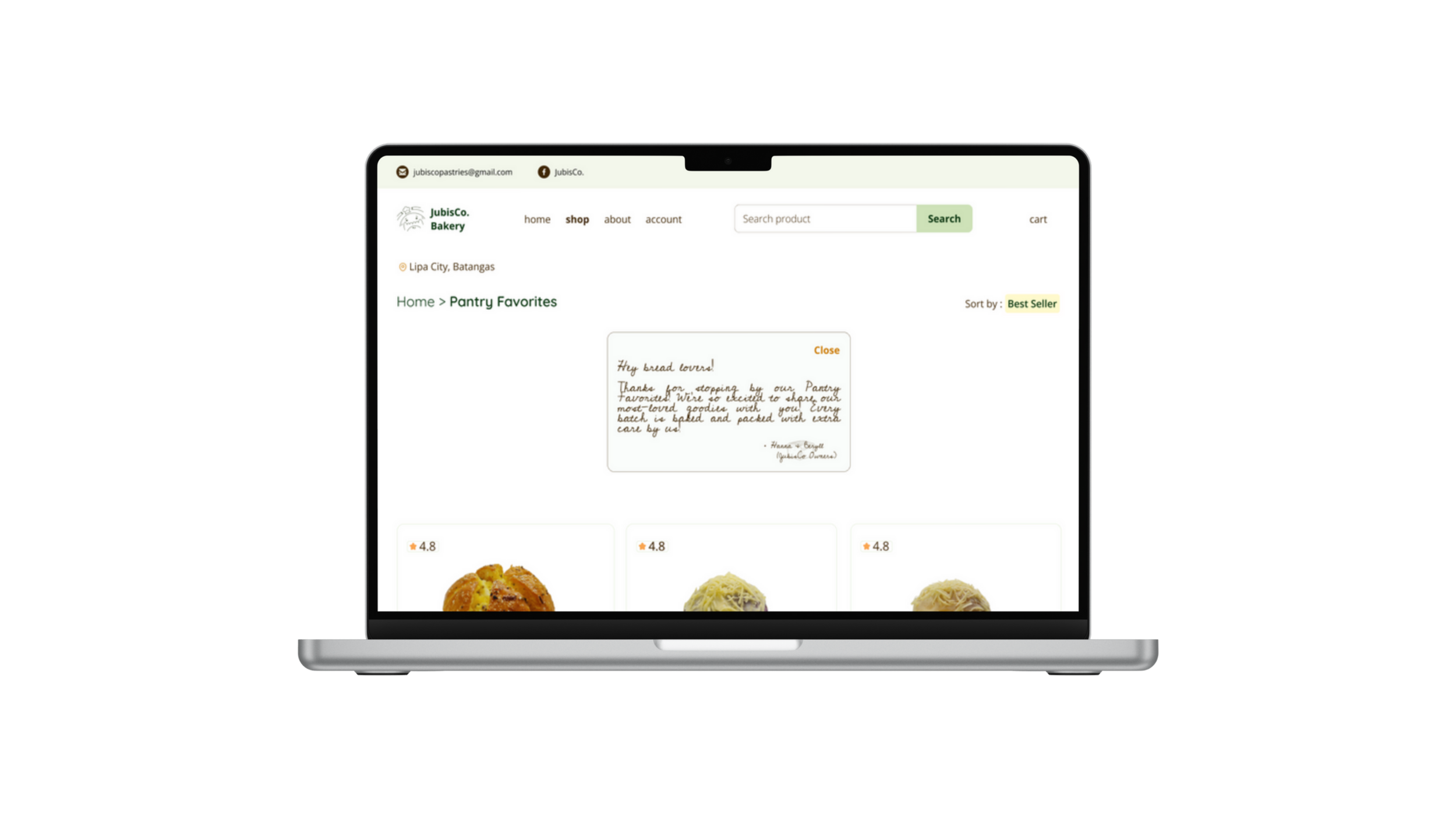
🥖 Product Gallery :
The product categories and sorting options are easy to understand. Owners suggested adding client feedback, recommendations, and referral sources to this screen.
📄 Detailed description :
The product categories and sorting options are easy to understand. Owners suggested adding client feedback, recommendations, and referral sources to this screen.
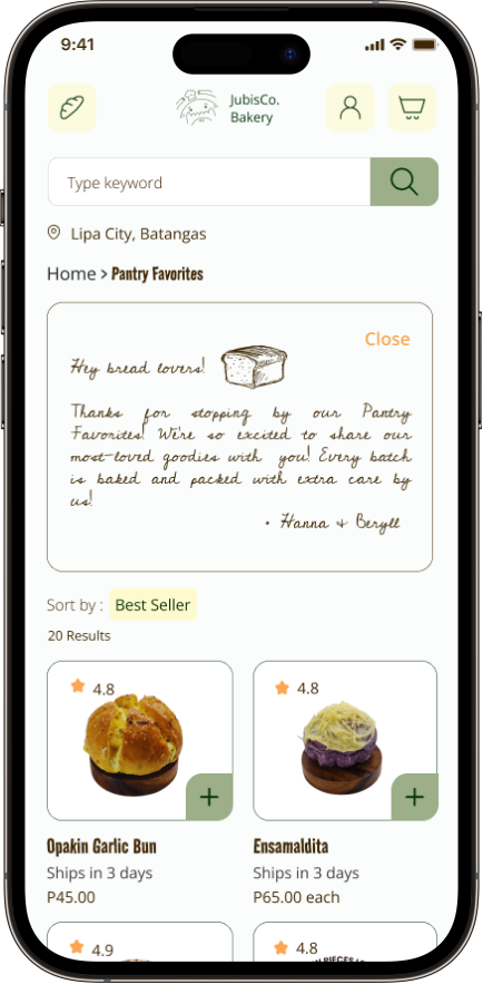
high fidelity wireframes
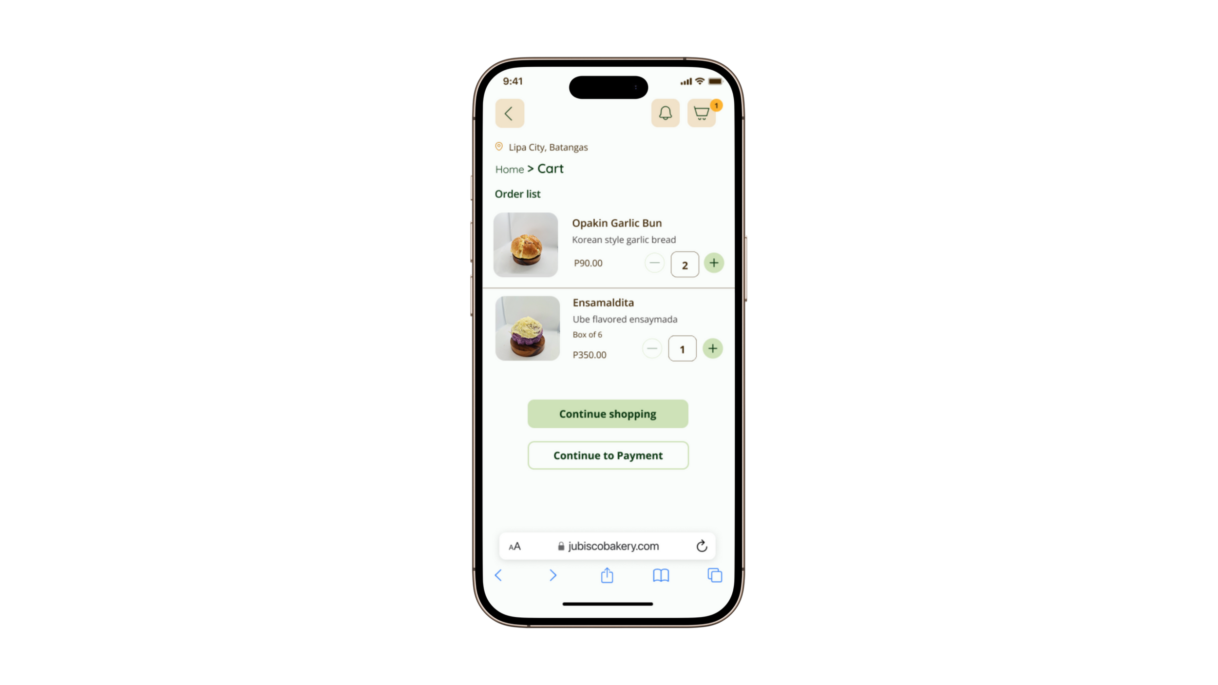
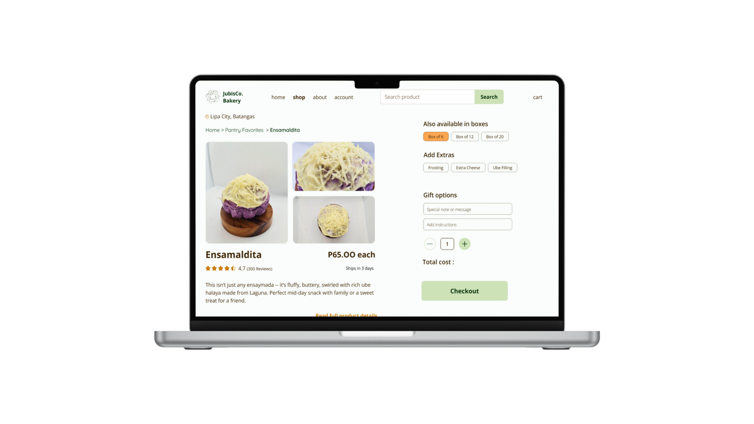
I wanted the interface to feel approachable. The homepage highlights bestsellers for first time customers and recent purchases for those who have an account already. I added options for quantity selection and availability indicators to reduce unnecessary messaging. Every screen was designed to simplify decision-making without losing the personal touch of the owners that makes Jubisco special.


testing & iteration
Shaping solutions and refining experience through feedback
P H A S E O N Eusability testing
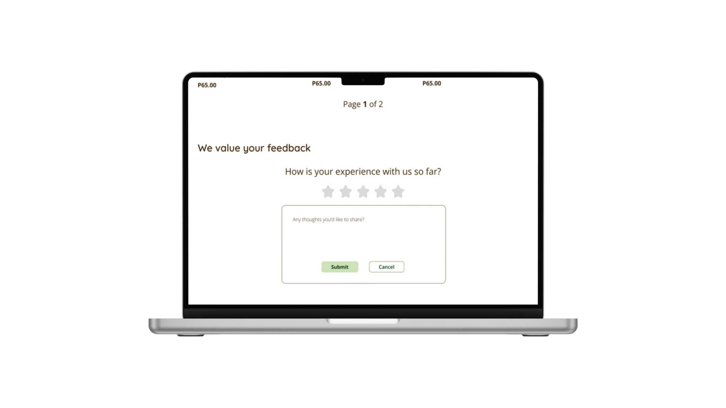
My goal with usability testing was to see how well the Jubisco prototype supported their customer needs especially for busy women like Ruthie who value simplicity, personal touch, trust and clear communication. I ran a remote, unmoderated test through Maze. I invited the current customers and the stakeholders to try out my proposed new experience.
🧁 TASKS:
Locate the Pantry Favorites and explore the
product gallery.
View the details for Ube Ensamaldita and
customize order for a box of 6.
Schedule a delivery for June 22 at 1:00 pm
on the checkout page.
Use the Track Your Order feature to check
the status.
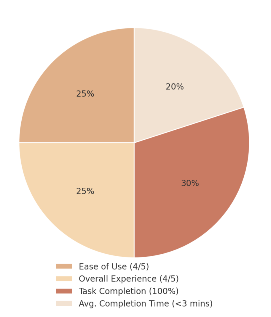
📊 RESULTS :
👏🏽 what worked..
Homepage design : The layout, colors and product images were described as inviting and easy to navigate especially by older users.
Product details: The ability to see customization options and product descriptions helped users feel confident about their orders
Order tracking : Testers appreciated the visibility into their order status and felt this gave the experience a more "professional but still personal” feel.
⚠️ what could be improved..
Call-to-Action color : The pale yellow CTA lacked contrast and confused a few participants who weren’t sure what was clickable.
Date picker feedback : The orange/yellow date selection led to uncertainty as participants were unsure which date was selected.
Quantity labels : Some users felt unsure what to select due to choice of terminology and suggested clearer instruction. Users wanted more explicit labeling such as “box of 6” to avoid confusion.
iterations
I made a few small but important refinements based on the usability testing. These changes were focused on reducing friction while keeping the overall feel of the interface simple, clear and true to Jubisco’s friendly brand.
ITERATION 1 : I adjusted the contrast and refined the indicators for clickable elements like CTAs. I also changed the font type based on my mentor’s feedback to improve readability.
after →
ITERATION 2 : I changed the quantity order buttons from "6 items" to "box of __" for more clarification. I also made them more uniform. This will better align with user expectations and improve communication.
after →
ITERATION 3 : I updated the delivery section by adjusting the button colors to improve visual hierarchy and draw clearer attention to call-to-action areas. I also refined the delivery slot UI to clearly indicate when a selected time is unavailable, helping users avoid confusion during checkout.
after →
final prototype
Time to bring it all together
🧭 what didn’t go as planned?
Adding a live chat feature didn’t align with the stakeholder’s needs. It wasn’t scalable for the business and didn’t fit their vision for maintaining customer interaction.
🛠️ what could have I done better?
Testing with end-users earlier could’ve provided insights before diving into high-fidelity designs.
🧠 what did I learn?
I learned that balancing efficiency and personal touch is key for Jubisco’s audience.
🕰️ if I had more one time..
I’d explore features such as interactive FAQs and gift customization features.