
TELADOC HEALTH
add a medication feature
A UX case study exploring how Teladoc Health app can better support caregivers in managing their loved ones' medications through a more integrated and intuitive experience.
role
duration
UX Designer
4 Weeks
tools
Figma, Lyssna, Survey Monkey, Loop11

project overview
This project stemmed from identifying a common challenge: caregivers feel overwhelmed trying to manage their loved ones' medications by using tools like phone alarms which are easy to miss or dismiss. Through interviews, I discovered a need for a more reliable, connected solution that supports caregivers in feeling confident and informed. While not all participants used Teladoc, I saw a potential in leveraging its existing virtual care platform to build a more integrated medication management experience tailored to caregiver and patient needs.
the challenge
Many caregivers are overwhelmed trying to keep up with loved ones' medications routine. According to research published by BMC Geriatrics, 38.9% of caregivers experience burden related to medication assistance with 56.7% encountering challenges in this area. There's clearly a gap in how existing solutions support caregivers in feeling confident and informed.
discovery
A closer look on how I uncover insights
user interviews
I spoke with caregivers between the ages of 35-45 years old to understand how they manage their loved ones' medications, what tools they rely on and what challenges do they face. I purposely chose this age range as they often represents individuals who are simultaneously caring for aging parents or their own families while managing their careers. They tend to be digitally literate but time-constrained, making them the ideal group to uncover pain points around managing medications efficiently. Their unique individual role provides valuable insight into how technology can better support caregiving responsibilities.
affinity mapping
After conducting the interviews, I organized the insights that gathered. I grouped the feedback based on what’s a recurring theme to ensure I may be able to design a medication management feature that will directly address the most common pain point of the caregivers.
🧗🏻 challenges
🧰 tools
🤝🏽 needs
📝 what key insights emerged from my primary research?
from understanding these recurring issues..
Traditional methods :
Participants use alarms, pill boxes, health apps, camera and manual logs to address their challenges.
Challenges :
Participants struggle to remember to give medications on time whenever they are busy. There's also difficulty in confirming whether the medication was taken sometimes, leading to anxiety and additional checks.
➡️
to identifying opportunities for a solution..
Reminders are critical :
Consistent and timely reminders are crucial for ensuring medications are taken as prescribed. Caregivers rely heavily on phone alarms to manage medication schedule.
Verification & coordination :
There is a significant need for a feature that allows caregivers to verify if medications have been taken or skipped.
user persona
After talking to caregivers and seeing how overwhelmed they are with managing medications, I created a user persona to represent what a typical caregiver from my target audience might be going through. This helped me stay focused in the real struggles they face–like juggling tools, forgetting doses and feeling anxious.
competitor analysis
I wanted to understand the current landscape, identify common gaps and explore how Teladoc could better support caregivers by integrating medication management into its virtual care platform.
-
Medisafe is the leading medication engagement platform that empowers patients to seamlessly manage their treatment journey.
-
The MedFriend feature notifies a friend or family member if a user misses a dose adding a layer of adherence through support and accountability.
-
The unique feature to enlist friends or family members to receive notifications if a dose is missed promotes a culture of “support” for the user. This personal approach gives them an edge from others.
-
MyTherapy is your personal, digital health companion. Reliable medication reminders and consistent documentation of your intakes
-
MyTherapy offers a diary feature for logging health activities, mood and symptoms which allow users to track their health journey.
-
MyTherapy excels at integrating medication reminders with health tracking for symptoms to help users manage their overall condition.
-
Hero app is your go-to solution for medication tracking, allowing you to see real-time updates about dose scheduling, medication information, and refill needs.
-
Hero tracks medication inventory which alert users when they are running low and need to reorder.
-
The combination of physical dispenser and app differentiates Hero from other health platforms.
define
This is where I start to connect the dots
p o v
👤 Jay is a busy and caring grandson who needs a more reliable way to manage his grandmother’s medications. Phone alarms are not effective because they are easy to miss or dismiss. He needs a solution that simplifies caregiving, helps him more in control and ideally brings reminders into one place. An existing virtual care platform like Teladoc has the potential to meed that need.
h m w
💭 How might we help Jay feel more confident and in control when managing medications for his grandmother?
💭 How might we design a smarter, more reliable reminder system that goes beyond basic phone alarms?
💭 How might we streamline the medication management experience by adding a feature in an existing virtual care platform like Teladoc?
ideate
Turning insights into ideas
⭐️ how might we design a smarter, more reliable reminder system that goes beyond basic phone alarms by adding a feature in an existing virtual care platform like Teladoc?
story board
For this storyboard, I wanted to walk through what it might look like for a caregiver like Jay–using a new reminder feature inside the Teladoc app. I focused on a real-life moment: Jay gets notification that his grandma has a new prescription after a recent visit. From there, he opens the app, checks out the details and sets up alarms to help her stay on track with her meds. I kept the flow straightforward and familiar so it would be easy to see how the feature fits into someone’s everyday routine.
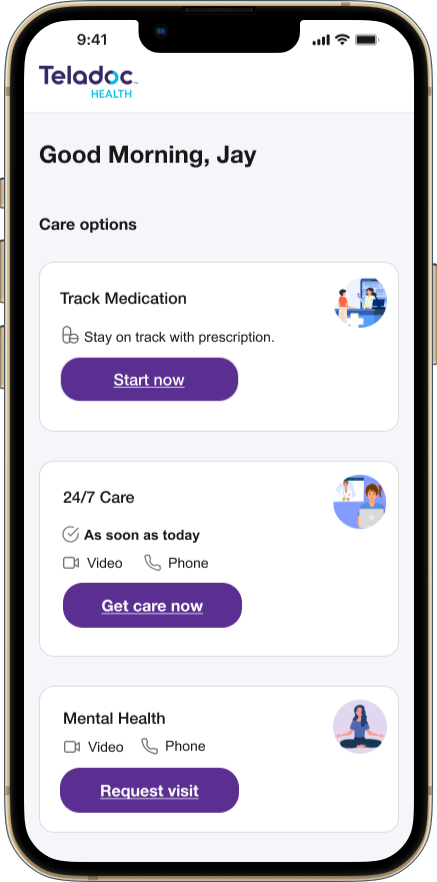
feature set
After visualizing Jay’s journey in my storyboard, I began identifying what core features would support this experience–features that are most important, which would be helpful and which could be added later..
user flow
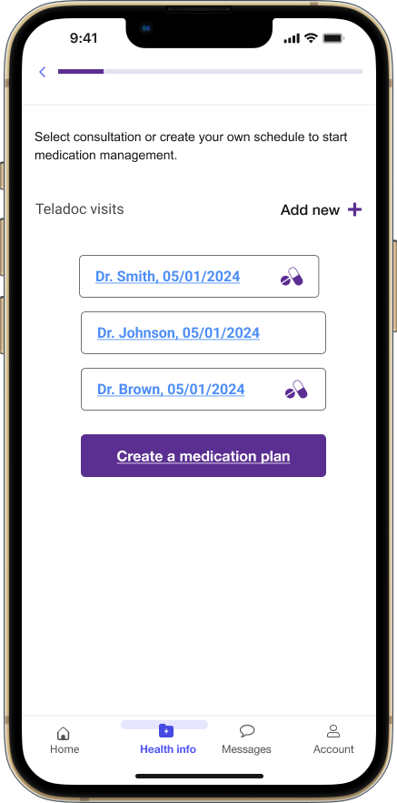
I mapped a user flow that will reflect how caregivers would interact with the medication management feature in the Teladoc app step by step–from receiving a notification of a new prescription to setting up the reminders.
While this wasn’t originally in the feature set, I realized the need for manual entry option for medications. I included the ability to manually add medications which helps if the prescription came from providers outside Teladoc network. This step allowed me to support flexibility and ensure continuity of care for users.
FLOW 1 : Setting up reminders/alarms from receiving a notifcation.
FLOW 2 : Jay adding a prescription manually from a doctor outside Teladoc network.
branding
Since Teladoc already has an established brand, I focused designing within those constraints. My goal was to create something that felt seamless and consistent with their existing look and layout while still adding value through thoughtful UX decisions.
color palette
typography
brand logo

buttons & icons
design
A closer look on how I uncover insights
low fidelity wireframes
For my low-fidelity wireframes, my goal was to integrate the medication management feature seamlessly within Teladoc’s existing layout, maintaining consistency with the app’s visual and navigational patterns.
📝 what I learned from my low-fidelity user testing?
To validate the usability of my design decisions and gather early feedback, I tested my paper prototypes with 6 participants using Loop11.
🧩 TASKS:
Locate the MediCheck feature:
Create a new medication plan.
Add time for your medication plan.
📄 FINDINGS:
6/6 participants were able to easily locate the medical management feature and appreciated the clear labels.
The visual cues like the pill icon were largely effective though 1/6 of participants struggled slightly due to the low-fidelity nature of the wireframes.
The process of adding a time to the medication plan was straightforward for most users though 1 participant suggested increasing the size of the “Add time” button to improve visibility for such an important task.
high fidelity wireframes
I moved into high-fidelity wireframes with a focus on making everything feel cohesive. I wanted to reflect Teladoc’s existing design system while adding clear interaction cues that would help users navigate the new management feature. My goal was to make it feel like native to the app.


testing & iteration
Shaping solutions and refining experience through feedback
P H A S E O N Eusability testing
My primary objective was to assess the ease of use and effectiveness of the new medication feature. I want to gather both qualitative and quantitative feedback to ensure that the feature will meet the needs of the caregivers managing their loved ones’ medications.
🧩 TASKS:
Locate the medical management feature.
Create a new medication plan.
Add a medication schedule.
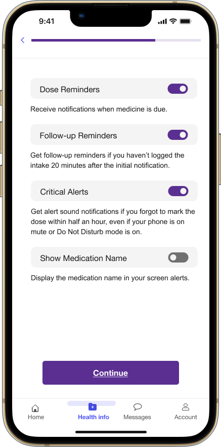
Navigate the notification settings.
📊 SUCCESS METRICS:
90% task completion rate
Task completion within a reasonable time
Less than 5% critical error rate.
User satisfaction score of 4 out of 5.
👏🏽 what worked..
Easy navigation : Everyone located the medication feature quickly.
Clear actions: Everyone understood how to create a medication plan, with most users finding it straightforward.
Medication scheduling : Nearly all users completed the scheduling easily but one of them suggested making the add button more visible.
👎🏽 what did not work..

Dosage selection confusion : Two of the participants were unsure which dosage to select due to lack of clear instructions.
Notification setup : The “Continue” button was disabled until notification was set which wasn’t obvious to some users. This caused a bit of frustration so making it more prominent or adding instructions would help.
Misclicks : One participant clicked the wrong feature highlighting the need to make each task more distinguishable.
iterations
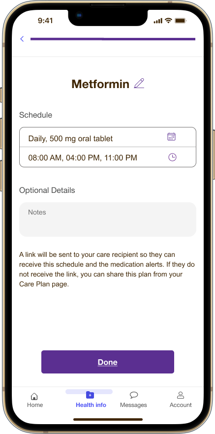
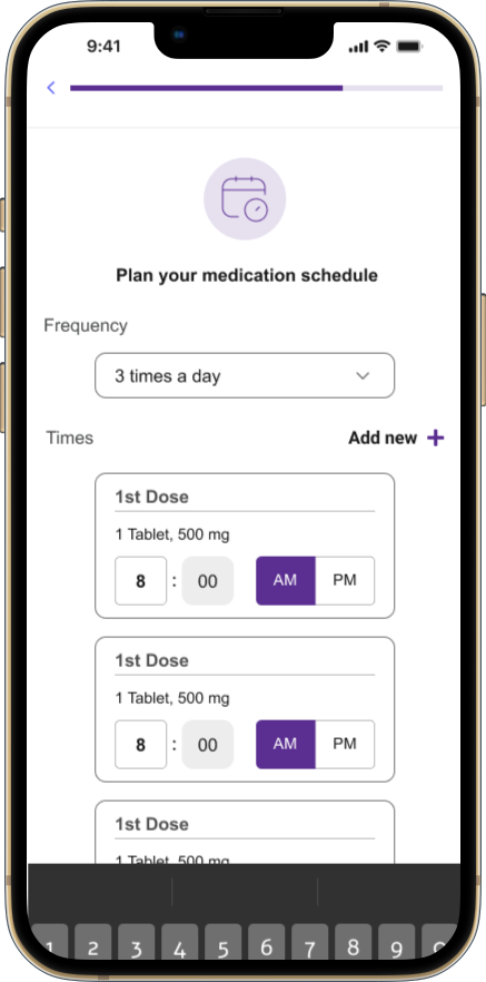
Based on usability feedback, some participants thought there can be a better way to schedule doses. Instead of manually adding times, I introduced auto-populated time slots that adjust based on the selected frequency of medication intake.
BEFORE : The user needs to manually press the “add new+” button every time they will add a dose reminder.
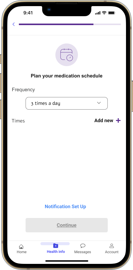
AFTER : The number of dose reminder cards will auto populate based on the frequency that the user will set.

P H A S E T W Omentor review
I worked closely with my mentor after the bootcamp. I used this time to step back, assess my design decisions, reflect on what to prioritize and make thoughtful adjustments. I focused on improving the feature and the UI based on my mentor’s feedback.
💡 One key insight was that the font I initially used didn’t align with Teladoc’s design system. I used Arial instead of Effra which was a big mistake. Another point of feedback of feedback was that my layout and navigation choices didn’t fully reflect the clean, modern direction of Teladoc’s lates app update. This pushed me to take a closer look at the visual and structural details in the live product. I revisited Teladoc’s screens to gain new insights so I can realign and refine my designs.
final prototype
Time to bring it all together
takeaways
what I learned and what I’d do next time
🧭 what didn’t go as planned?
At the start, I didn’t explore the Teladoc platform deeply enough. Since this project focused on enhancing an existing product, I realized at the end that I should’ve spent more time researching who actually uses Teladoc and what are their challenges with the app. Instead, I tried connecting two different problems–medication management and Teladoc new feature, which made things a little complex.
🛠️ what could have I done better?
I could’ve started with a cleared problem framing. Defining one specific challenge within Teladoc’s system would’ve helped keep the direction stronger.
🧠 what did I learn?
I learned not to rely on early assumptions and to trust the design process instead. Taking the time to uncover real insights before jumping into solutions is something I’ll carry into every project moving forward.
🕰️ if I had more one time..
I would’ve explored how the patient experience connects with the caregiver’s in using Teladoc’s new feature. For example, how do patients confirm or manage their own medications? How does someone become a care recipient in Teladoc?